
Blog
CYOC: The Story Behind Create Your Own Cheesecake & Cheesesteak

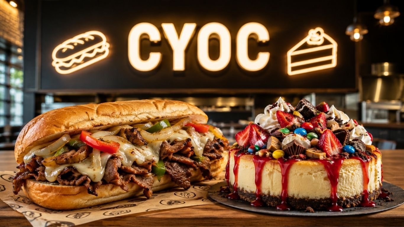
Create Your Own Cheesecake & Cheesesteak was an unusual fast casual restaurant idea from Illinois. It brought two rich comfort foods under one roof. Customers could build a hot Philly style cheesesteak and then create a dessert with cheesecake, candy, fruit, and other toppings.
- What Was CYOC?
- How the Restaurant Concept Started
- Why CYOC Stood Out From Other Fast Casual Restaurants
- The Custom Cheesesteak Experience
- The Create Your Own Cheesecake Idea
- Popular Flavors and Specialty Desserts
- Where Were CYOC Locations?
- Why Customers Remembered the Brand
- Was It a Traditional Philly Cheesesteak Shop?
- What Happened to the Restaurant?
- What Made the Business Idea Interesting?
- Final Thoughts
CYOC became known for choice. The concept was simple enough to understand in seconds. Pick a steak or chicken sandwich, choose the extras, then move to dessert. On the sweet side, cheesecake was served in a less traditional way, with flavors and mix ins that made each order feel personal.
What Was CYOC?
The name stood for Create Your Own Cheesecake & Cheesesteak. The business combined a sandwich shop with a dessert counter. Instead of building a large menu around many unrelated foods, it focused on two clear products.
CYOC built its identity around customization. Customers could shape a meal around their own taste. That made the ordering process part of the experience, not just a step before eating.
The idea also helped the restaurant stand apart from standard burger, pizza, and sandwich chains. A cheesesteak followed by a custom cheesecake was a simple pairing. Yet it was unusual enough to be easy to remember.
How the Restaurant Concept Started
The Waukegan restaurant was linked to founder Joshua Kirkwood. A 2011 local report described it as his first business venture. It also said that he had spent years making cheesecake at home before opening the store.
The original idea was not to copy a classic cheesecake shop. Kirkwood changed the serving style. Cheesecake could be served by the scoop, with toppings added after the customer chose a flavor.
That small change gave the dessert a more casual feel. It also made cheesecake work more like ice cream or frozen yogurt. Each guest could build a different final dish.
Why CYOC Stood Out From Other Fast Casual Restaurants
Many fast casual restaurants use customization. Burrito shops, salad bars, and pizza concepts often let people pick ingredients. This restaurant applied the same idea to two foods that were rarely paired in one concept.
CYOC stood out because both sides of the menu had a clear theme. The savory side focused on cheesesteaks. The sweet side focused on cheesecake. That kept the brand easy to understand.
The idea also worked well for groups. One person could order steak while another chose chicken. Dessert could stay simple or become loaded with candy, fruit, sauce, and other mix ins.
The Custom Cheesesteak Experience
The cheesesteak menu centered on hot sandwiches made with steak or chicken. Customers could choose vegetables, cheese, and other extras. A popular style called The Works included onions and green peppers with cheese.
Fresh preparation was part of the appeal. Older reports described ingredients cooking on the grill after an order was placed. The meal might take longer than a premade fast food item, but guests gained more control over it.
The brand also promoted its own sauce. Its website described the sauce as a house feature created by the founder. That gave the sandwiches another point of difference from a standard Philly cheesesteak.
Steak or Chicken
The choice between steak and chicken made the core menu broad without making it confusing. Guests could keep the same toppings while changing the protein.
Cheese and Vegetables
Cheese, peppers, onions, and other vegetables let each person change the flavor and texture. This simple build your own model could also make repeat visits feel less repetitive.
The Create Your Own Cheesecake Idea
Dessert was the most unusual part of the concept. Instead of serving cheesecake only as a fixed slice, the restaurant offered prepared flavors that could be combined with toppings and candy pieces.
Historical coverage listed flavors such as original cheesecake, cookie dough, chocolate, strawberry, Oreo, mint chocolate chip, and lemon. Guests could then add items such as cherries, chocolate chips, coconut, peanuts, candy bars, and graham crackers.
This approach made cheesecake more playful. A customer who liked fruit could keep the dessert simple. Someone who wanted something richer could add chocolate, candy, and several toppings at once.
Popular Flavors and Specialty Desserts
The menu gave customers enough choices to create many combinations without changing the main concept. That was useful for a restaurant based on repeat visits. A guest could try a different dessert on each visit.
Specialty options also gave people a faster choice when they did not want to build a dessert from scratch. A banana split cheesecake was one example mentioned in early coverage of the restaurant.
The mix of set ideas and custom orders was simple. New customers could follow an existing combination. Regular guests could test their own mixes.
Where Were CYOC Locations?
The best known store was at 2114 N. Green Bay Road in Waukegan, Illinois. The brand also had a North Chicago address on Green Bay Road. Older restaurant and delivery records also connect the concept with Fox Lake, Illinois.
CYOC also used takeout and delivery. That helped the food reach customers outside the dining room. These services suited a menu based on sandwiches, fries, and portable desserts.
Current directory information marks the Waukegan restaurant as closed. Some old delivery pages remain online, but they should not be treated as proof that a location is still operating.
Why Customers Remembered the Brand
A strong local restaurant often becomes memorable because of a few clear things. This concept had several. It had a simple name, an unusual food pairing, a build your own format, and rich comfort food.
Customer reviews often focused on the cheesesteaks, cheesecake choices, friendly service, and fresh food. Some guests also liked the family friendly feel and the chance to watch food being prepared.
The menu also had a social side. A large custom dessert or loaded cheesesteak could become something people talked about, photographed, and recommended. That type of food can create natural word of mouth.
Was It a Traditional Philly Cheesesteak Shop?
Not exactly. The menu used the Philly cheesesteak idea as a base, but the restaurant was built around choice. Guests could select steak or chicken, then change the vegetables, cheese, sauce, and other parts of the sandwich.
That makes the concept closer to a customizable fast casual shop than a strict Philadelphia style cheesesteak counter. Its goal was not only to copy one classic sandwich. It was to let customers build a version they liked.
The cheesecake side made the difference even clearer. Few traditional cheesesteak shops center their brand on a large custom dessert menu.
What Happened to the Restaurant?
The known physical locations appear to have closed. Current listings for the Waukegan store show it as closed. Delivery pages for former locations may also show the restaurant as inactive.
This can cause some confusion because old brand pages still exist online. A working website, old menu, or restaurant profile does not always mean a business is still serving customers.
Local businesses can leave old pages and delivery records online long after their operations change. For that reason, it is safer to view the business as a historical Illinois restaurant concept unless a new verified location is announced.
What Made the Business Idea Interesting?
The concept offers a useful lesson in restaurant branding. A business does not always need a huge menu to look different. It can create a clear identity by combining two strong products and giving customers control over each one.
The name also explained the experience. “Create Your Own” told customers what to expect before they saw the menu. The brand promise and the ordering process matched.
There was also a clear contrast between hot and cold, savory and sweet, familiar and unusual. Cheesesteaks gave the menu a comfort food base. Custom cheesecake gave it a signature twist.
Final Thoughts
Create Your Own Cheesecake & Cheesesteak was a distinct local food idea. It paired made to order steak or chicken sandwiches with a dessert system built around cheesecake flavors, toppings, and candy mix ins.
The concept grew beyond its original Waukegan base and became known in nearby parts of northern Illinois. Its old menus and reviews show a brand that relied on simple choices, fresh preparation, and an easy to remember theme.
CYOC remains an interesting example of how a small restaurant can stand out through a narrow menu and strong customization. Even though its known physical storefronts are now listed as closed, the concept is still easy to understand. Build the cheesesteak you want, then build the cheesecake you want.

Outfit transition videos have become one of the most addictive formats on social media — a single snap of the fingers, a spin, or a blink, and suddenly the outfit completely changes. What used to require quick-Changing costume tricks and careful editing can now be built directly from still photos using AI technology.
- What Was CYOC?
- How the Restaurant Concept Started
- Why CYOC Stood Out From Other Fast Casual Restaurants
- The Custom Cheesesteak Experience
- The Create Your Own Cheesecake Idea
- Popular Flavors and Specialty Desserts
- Where Were CYOC Locations?
- Why Customers Remembered the Brand
- Was It a Traditional Philly Cheesesteak Shop?
- What Happened to the Restaurant?
- What Made the Business Idea Interesting?
- Final Thoughts
Dreamina, powered by its latest and most advanced image to video generation model, Seedance 2.5, lets anyone turn a couple of outfit photos into a slick, seamless transition clip without touching a single video editing timeline.
Considering wardrobe availability before filming
Since the format relies entirely on existing photos rather than live footage, it helps to pull from a wardrobe that’s already been photographed cleanly in the past, rather than scrambling to shoot new reference images specifically for the video, which can slow down the whole process considerably.
Why outfit transitions are so watchable
There’s something almost hypnotic about a clean transition — the eye expects one thing and gets another instantly. That small surprise is exactly why this format keeps performing well across platforms, and it’s a format built entirely around a satisfying visual snap rather than a long, drawn-out narrative.
What makes a transition feel genuinely seamless
A few details separate a transition that lands from one that feels choppy:
- A consistent pose and camera angle across both outfit photos
- A clear trigger moment, like a snap, spin, or hand wave, that cues the change
- Lighting that stays consistent so the switch doesn’t feel jarring
Snapping into a new look: Three steps with Dreamina
Step 1: Upload your outfit photo and describe the transition
Visit Dreamina and sign in, then head to the “AI Video” section. Click “Add reference image” to upload your photo, then add your prompt to describe the video.
For a 30-second video, try: Using the person and streetwear outfit from the reference image, generate a 30-second video: the person standing confidently, then snapping their fingers as the outfit instantly transitions into an elegant evening look, a quick flash of light marking the change, and the camera holding a steady frame throughout to keep the transition clean.
Step 2: Generate your transition with Seedance 2.5
After adding your image and prompt, choose the Seedance 2.5 model for generation. Next, choose the video length, then a suitable aspect ratio — pick 16:9 for YouTube or 9:16 for TikTok. Finally, click Dreamina’s icon and wait a few seconds for processing.
Step 3: Polish and post your finished clip
Polish your video before saving it with Dreamina’s AI editing tools. Use advanced AI tools like Upscale for higher resolution or Generate soundtrack for adding audio. Finally, export and share it on social media platforms.
Reusing the same format across different themes
Once an outfit transition template works well, the same structure, snap, spin, or hand wave can be reapplied to entirely new outfit pairings without needing to rethink the format from scratch, making this an easy way to turn into a recurring content series.
Choosing outfit combos that pop on screen
Not every pairing creates equal impact. Outfits with a strong contrast in color, formality, or style tend to produce a far more satisfying transition than two looks that are visually similar, since the switch needs to actually register at a glance for the format to work.
Seedance 2.5: Precision behind the perfect snap
Reduced “AI look” for believable fabric and texture
Outfit transitions live or die on how convincing the clothing looks mid-change, and Seedance 2.5 has significantly reduced the artificial texture that used to make generated fabric look stiff or synthetic.
Handling consistent poses across the transition
The model addresses the “twin” duplication issue and helps maintain consistent facial features and body positioning, which matters enormously in a format where the same person needs to look identical before and after the switch.
Precise local editing
Local editing allows small distracting elements, like a stray background object, to be removed without regenerating the entire transition clip.
Longer clips for multi-outfit sequences
Native generation supports clips up to 30 seconds, with the “Ultra-long Video Generation (beta)” mode extending that range up to 180 seconds, enough room to chain together several outfit changes in one continuous video.
Timing the transition for maximum impact
The exact moment a transition lands matters just as much as the outfits themselves. Syncing the switch to a beat drop or a specific sound effect during editing tends to make the reveal feel more satisfying than a transition placed at a random point in the clip.
Building a multi-look video from several outfits
A single transition is fun, but stringing several together — casual to formal to athletic to glamorous — turns a simple clip into a genuine style showcase, giving viewers a reason to watch the full video rather than just the first switch.
Common mistakes that undercut a transition
A handful of habits tend to weaken otherwise strong results:
- Using outfit photos taken from noticeably different angles or distances
- Choosing looks that are too visually similar to register as a real change
- Skipping sound design, which often does half the work of selling the moment
Where these outfit transition videos perform best
This format works especially well for fashion and styling content, personal brand social pages, thrift and secondhand fashion promotion, and clothing brand marketing, where a quick, satisfying visual switch often earns far more engagement than a standard styled photo post.
Final thought
An outfit transition was always about that split-second of surprise. With Dreamina and the seamless precision behind Seedance 2.5, that surprise can now be built directly from still photos, giving anyone the tools to create the kind of snap-change video that used to require a full production crew.
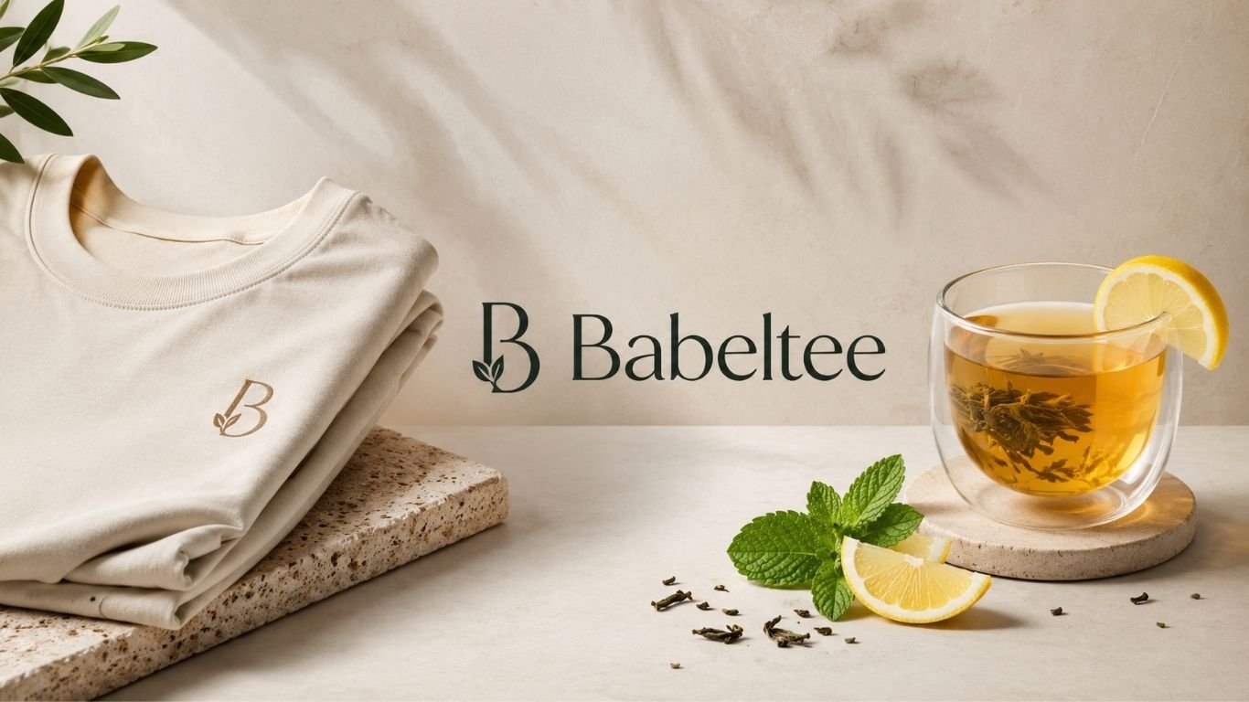
Babeltee is a new online term that can be confusing at first. A search for the name brings up fashion pages, tea guides, and general digital content. There is no single, widely accepted meaning that covers every use of the word. That makes context very important when you see it on a website, social post, or product page.
- What Is Babeltee?
- Why Is the Name Getting Attention Online?
- Is It a Fashion Name or a Tea Term?
- Understanding the Fashion Meaning
- Understanding the Tea Meaning
- How to Tell What a Page Means
- Is There One Official Brand Behind the Name?
- What Should Shoppers Check Before Buying?
- What Should Tea Drinkers Check?
- Why Context Matters for Search Results
- Could the Meaning Change Over Time?
- Final Thoughts
The safest way to understand the term is to look at where it appears and what the page is offering. Some sources use it as a style or T-shirt concept. Others use it for a flexible tea drink. A few sites treat the name as a broad digital identity. Because these uses do not fully match, readers should avoid assuming that every result refers to the same brand or service.
This guide explains the main meanings found online. It also shows how to judge pages, products, and claims linked with the term.
What Is Babeltee?
Babeltee does not yet have one clear definition across the web. The exact-match UK site presents the term as a modern T-shirt and fashion idea. It links the name with clean design, comfort, and simple styling. Other recent publishers use the same word for a customizable tea concept made with tea bases, fruit, herbs, milk, or sweeteners.
This split matters. It means the word can point to different topics depending on the search result. One page may discuss clothing, while another may explain a drink. Before you trust a claim, check the page topic, author, product details, and contact information.
Why Is the Name Getting Attention Online?
Unusual names often attract clicks because people want to know what they mean. The word is short, easy to remember, and close to several familiar terms. It can sound like “bubble tea,” while the ending “tee” can also suggest a T-shirt.
That overlap may explain some of the search interest. People can reach the term through a typo, a brand-style name, a fashion post, or a tea article. Search engines then group many types of pages around the same word.
This is common with newer online terms. A name can spread before one fixed meaning becomes dominant.
Is It a Fashion Name or a Tea Term?
At the moment, both uses appear online. The UK domain built around the name mainly frames it as a fashion idea. Its pages discuss T-shirts, fabric, fit, simple graphics, and custom apparel.
Other recent articles use the word in a drink setting. These guides describe a loose tea concept rather than a formal recipe. They often suggest starting with black, green, herbal, matcha, or fruit tea and then adding flavors based on personal taste.
So the answer depends on the source. There is not enough consistent evidence to treat all uses as one official product category.
Understanding the Fashion Meaning
In fashion-focused pages, Babeltee is linked with simple T-shirt design. The idea centers on comfort, clean looks, easy styling, and clothing that works in more than one setting.
That can include plain shirts, small graphics, soft fabrics, neutral shades, or custom prints. The concept fits a wider trend toward basic pieces that can be worn with jeans, trousers, jackets, or layered outfits.
Still, shoppers should look beyond broad style claims. Check the actual fabric, size chart, print method, return terms, shipping details, and seller identity before buying.
Fabric and Fit Matter Most
A T-shirt can look good in photos and still feel poor in daily use. Cotton weight, stitching, neck shape, sleeve length, and shrinkage all affect comfort.
Look for clear product details. Good sellers should explain what the shirt is made from and how it should be washed.
Understanding the Tea Meaning
Some current sources describe Babeltee as an informal name for a custom tea drink. In this use, there is no fixed recipe. The drink can change based on tea type, fruit, herbs, milk, ice, sweetener, and toppings.
That makes it different from a strict traditional drink with set rules. It is closer to a flexible idea for building a tea that matches your taste.
It is also important not to confuse this use with bubble tea. Bubble tea is an established Taiwanese drink commonly linked with tea and tapioca pearls, while current sources do not identify the newer term as a formal drink category with the same defined background.
What Could Go Into the Drink?
A simple version may start with black or green tea. You can then add lemon, berries, mint, milk, honey, or another sweetener.
If you buy a drink under this name, ask what is inside it. Caffeine, sugar, dairy, and allergens can vary from one recipe to another.
How to Tell What a Page Means
The fastest way to understand Babeltee is to study the page around the word. If you see size charts, shirts, fabric, prints, or outfit photos, the page is probably using the fashion meaning.
If the page talks about tea leaves, fruit, milk, ice, or toppings, it is using the drink meaning. If neither group appears, the term may simply be a site name, project label, username, or search keyword.
Do not rely on the name alone. The surrounding words usually tell you far more than the brand-like term itself.
Is There One Official Brand Behind the Name?
Current public results do not show one clear global owner that controls every use of Babeltee. The same term appears in unrelated content types. Even exact-match web pages do not create a single shared definition.
That does not mean every page using the word is false. It only means readers should separate each use and judge it on its own evidence.
If a site claims to be an official seller or platform, look for basic trust signals. These include a real company name, working contact details, clear policies, secure checkout, and a record of customer activity.
What Should Shoppers Check Before Buying?
If you find clothing or another product under this name, start with the basics. Read the product page from top to bottom. Check materials, measurements, color choices, shipping times, return rules, and payment methods.
Also compare the seller’s claims with independent feedback when possible. Product photos should match the item description. Prices that seem far below normal market levels deserve extra care.
A simple check can prevent many common online shopping problems.
What Should Tea Drinkers Check?
When Babeltee appears on a café menu or recipe page, focus on ingredients instead of the label. Ask what tea base is used. Check whether milk, dairy alternatives, syrups, fruit, or toppings are added.
This is useful for people who watch sugar, caffeine, or allergens. The name itself does not tell you the nutrition profile.
If you make a version at home, keep the recipe simple at first. Start with tea, one fruit or herb, and a small amount of sweetener. Then adjust it to your taste.
Why Context Matters for Search Results
Search engines can show several meanings for one new or unclear word. This can make Babeltee look more established than it really is. A large number of pages does not always mean there is one company, product, or standard behind them.
Look for agreement between sources. Check publication dates. Read more than one page. If claims conflict, prefer the source that gives clear evidence, names, product details, or verifiable company information.
This habit is useful for any unfamiliar online term, not just this one.
Could the Meaning Change Over Time?
Yes. Online names can gain a fixed meaning if one brand, product, or community becomes dominant. A term that feels unclear today may become easy to define later.
Babeltee may keep its mixed use, or one meaning may become more common. The fashion angle could grow. The tea meaning could spread. A separate business could also adopt the name.
For now, the best approach is to treat the word as context-based and verify each page on its own.
Final Thoughts
Babeltee is best understood as an emerging and flexible online term rather than one fully settled category. Current search results connect it with fashion, T-shirts, tea drinks, and broader web content. That mix explains why users can find very different answers.
The key is simple. Check the context before you decide what the term means. Look at the product, page topic, seller details, ingredients, or service description. Clear evidence is more useful than a catchy name.
As the term develops, its meaning may become more stable. Until then, careful reading gives the clearest answer.
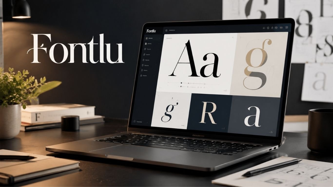
Typography can change how a design feels in seconds. A bold typeface can make a brand look strong. A soft script can make it feel friendly. Fontlu is an emerging typography platform made for designers, developers, and digital creators who want a simpler way to explore typefaces.
- What Is the Platform Designed to Do?
- Why Font Discovery Can Be Difficult
- Real-Time Font Previews Make Choices Faster
- Filters Can Narrow a Large Font Library
- How Font Licensing Affects Creative Work
- Free and Premium Fonts Serve Different Needs
- How Designers Can Use Fontlu in Branding
- Is It Useful for Web and App Projects?
- How Content Creators Can Benefit
- Tips for Choosing the Right Typeface
- Why a Focused Typography Platform Can Save Time
- Bottom line
The platform brings font discovery, previews, and useful font details into one place. Users can browse styles, test their own words, and see how a typeface may fit a logo, website, post, or other design.
This can save time when a project needs the right visual tone. It can also make font choice easier for people who do not have deep typography skills.
What Is the Platform Designed to Do?
Fontlu works as an online font discovery and preview hub. Its main goal is to help users find typefaces without moving through many different sites or opening font files one by one.
The platform can be useful for both skilled designers and beginners. A user can start with a simple idea, such as a clean business font or a playful display style. From there, the available tools can make the search more focused.
Typography is not just decoration. Font choice can affect trust, mood, readability, and brand identity. A clear font can make a page feel calm. A poor match can make even good content harder to use.
Why Font Discovery Can Be Difficult
There are thousands of typefaces online. That sounds useful, but too many choices can slow down a project. Designers may spend a long time opening tabs, testing samples, and reading license pages.
The problem gets harder when two fonts look similar at first. Small details in spacing, weight, curves, and letter shape can change how text reads. A font that works in a large heading may feel weak in a paragraph.
A well-organized typography hub can cut through that noise. It can place useful choices in front of the user and reduce the time spent on random searching.
Real-Time Font Previews Make Choices Faster
One useful part of Fontlu is the ability to preview custom text in a selected typeface. Instead of judging a font by a sample word, users can test the real text they plan to use.
This is helpful for logos, product names, headlines, quotes, and social posts. A business owner can type a brand name and see how it looks before making a choice. A designer can test short and long words to check balance.
Real-time previews also make comparison easier. Users can focus on shape, spacing, and tone before they download or use a font.
Filters Can Narrow a Large Font Library
A large font collection is only useful when people can find what they need. Fontlu aims to make browsing easier through filters tied to style, mood, or possible use.
For example, a user may want a modern font for a tech page. Another may need a classic serif for editorial work. Someone else may want a casual script for an invitation.
Filtering can reduce a long list into a smaller group that fits the job. This can also help users who do not know font names. They may know the feeling they want but not the exact typeface.
How Font Licensing Affects Creative Work
Font licensing is one of the most important parts of using type online or in print. A typeface may be free for personal use but require a paid license for a business, product, logo, or client project.
Fontlu places emphasis on making usage terms easier to understand. Users should still check the exact license attached to any font before using it in commercial work.
This step protects both the creator and the user. It can also stop a project from needing a late font change because the chosen typeface cannot legally be used for its planned purpose.
Reading a license may take a few minutes. That small step can prevent bigger problems later.
Free and Premium Fonts Serve Different Needs
Free fonts can be a good fit for school work, personal designs, tests, and some business projects when the license allows it. Premium fonts may offer more weights, better language support, extra symbols, or wider usage rights.
Fontlu brings both types of choices into the discovery process. That gives users room to match a typeface to their budget and project goals.
Price alone should not decide the choice. A simple free font may be perfect for a small project. A paid font family may make more sense when a brand needs many weights and a steady look across several channels.
The best option is the one that fits the design, budget, and legal use of the project.
How Designers Can Use Fontlu in Branding
Branding depends on repeated visual choices. Color, images, spacing, and type all work together. A font can make a brand feel modern, formal, warm, bold, playful, or calm.
A designer can use Fontlu to test brand names, slogans, and sample headings before settling on a style. This early testing can reveal whether the typeface fits the message.
It also helps to test more than one weight. A brand may need a bold heading, a regular paragraph style, and a lighter option for small details.
Good font planning keeps these parts connected. It can also make future design work much easier because the brand already has clear type rules.
Is It Useful for Web and App Projects?
Web developers need fonts that look good and stay readable on many screen sizes. They also need to think about file size, font formats, licensing, and how the typeface behaves in a browser.
Fontlu can support the early design stage by helping teams compare font styles before implementation. Developers can use previews to judge whether a typeface fits buttons, headings, menus, and body text.
A font may look strong in a logo but weak in a long article. Testing several uses can help a team spot this issue early.
The final technical setup still depends on the font source and its license. Teams should confirm supported formats and web use rights before adding any font to a live product.
How Content Creators Can Benefit
Typography matters on social media, video thumbnails, digital posters, presentations, and branded graphics. Strong text can catch attention before a viewer reads the full message.
Fontlu can help creators test short phrases and find a style that matches the content. A clean sans serif may work for a tutorial. A bold display font may suit an event poster. A softer style may fit lifestyle content.
Creators should still keep readability first. Fancy letters can look attractive, but they may fail when text is small or viewed on a phone.
It also helps to keep font use consistent. Using too many type styles can make a design look busy. One or two strong font choices are often enough.
Tips for Choosing the Right Typeface
Start with the purpose of the project. Ask what the text needs to say and how the audience should feel. This makes it easier to reject fonts that look nice but do not fit the message.
Next, test real words instead of sample text. Use the actual brand name, heading, or phrase. Check both short and long lines. Look at uppercase and lowercase letters if both will appear in the final design.
Then compare readability. A typeface should remain clear at the size you plan to use. Also check spacing, numbers, punctuation, and special characters when the project needs them.
Finally, read the license before publishing. This is especially important for client work, ads, products, logos, apps, and websites.
Why a Focused Typography Platform Can Save Time
The main value of Fontlu is not just access to fonts. It is the chance to make the selection process more direct. Preview tools, organized browsing, and clearer usage information can reduce trial and error.
That can matter on fast projects. Designers often need to show options to a client, build a mockup, or prepare content on a deadline. A focused platform can help them move from idea to shortlist with fewer steps.
It can also make typography less intimidating for beginners. Instead of learning every font term first, a new user can explore by look, mood, and use case.
The result can be a faster and more confident design process. Users still make the final creative choice, but better tools can make that choice easier.
Bottom line
Fontlu is aimed at people who want a simpler way to explore typography. Its mix of font discovery, custom previews, filtering, and licensing guidance can support many kinds of creative work.
The platform may be useful for graphic design, web projects, branding, social content, and personal work. The best results still come from careful choices. Users should test readability, compare styles, and check the license for every font they plan to publish.
Typography shapes how people read and feel a message. A tool that makes that choice easier can become a useful part of a modern creative workflow.

How to Create AI Outfit Transition Videos

How General Dentistry Provides Comfort Through Modern Techniques

Who Is Marshall Trenkmann? The Real Story Of Karla Souza’s Husband

Alex Pettyfer Net Worth, Wife, Age, Height, Children, Career and More

Brad Williams Net Worth, Wife, Height, Age, Daughter, Family, Career and More

Sanzoku Bandits of One Piece: Origins, Higuma, and Their Role in Dawn Island
-
Celebrity9 months ago
Alex Pettyfer Net Worth, Wife, Age, Height, Children, Career and More
-
Celebrity9 months ago
Brad Williams Net Worth, Wife, Height, Age, Daughter, Family, Career and More
-
Anime10 months ago
Sanzoku Bandits of One Piece: Origins, Higuma, and Their Role in Dawn Island
-
 Blog2 weeks ago
Eldorado.gg Review 2026: How It Works, Safety, Fees, and Risks
-
 Celebrity9 months ago
John McGinn Net Worth, Age, Height, Wife, Childrens, Career and More
-
 Celebrity9 months ago
Frances de la Tour Net Worth, Age, Height, Husband, Childrens, Career and More
-
 Blog3 weeks ago
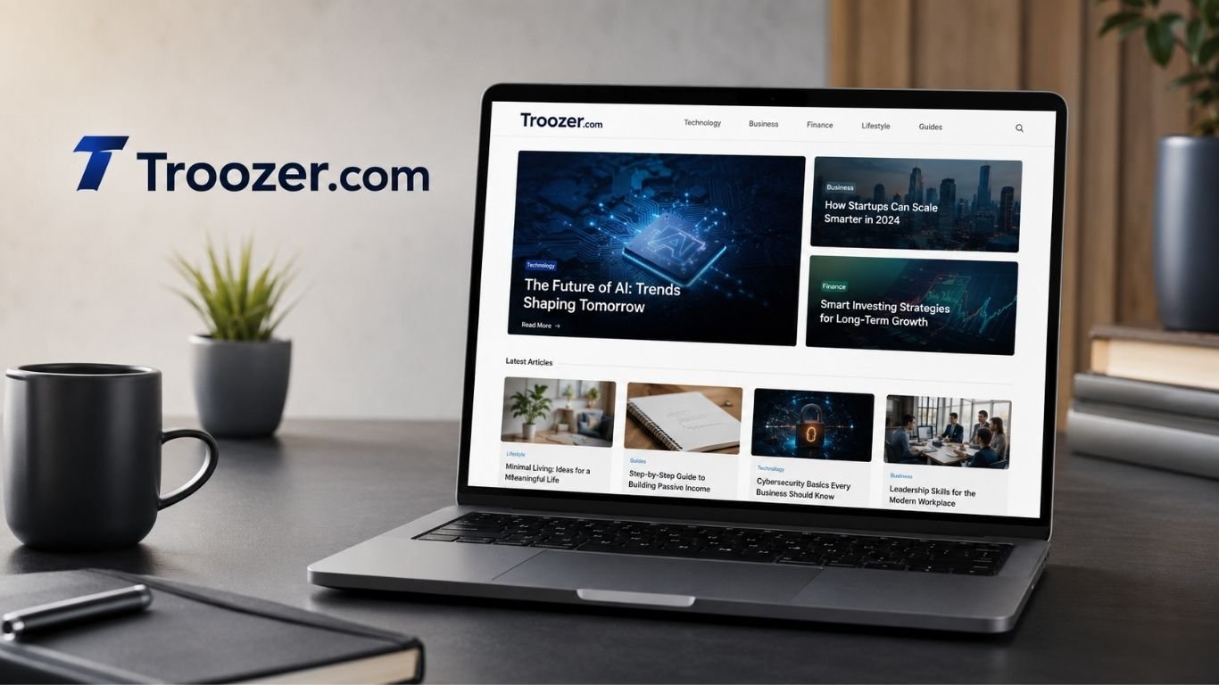
What Is Troozer.com? A Clear Guide to the Digital Content Site
-
 Celebrity9 months ago
Will Trickett Net Worth, Wife, Childrens, Age, Career and More