
Technology
How I Made File Management Fun Again with iTop Easy Desktop

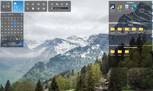
My desktop used to look like a junk drawer someone had turned sideways and shaken. Screenshots from three projects ago, half-named documents, random installers I never deleted, all scattered across the screen with no logic to any of it. I told myself it didn’t matter since I knew where everything was, but I was lying to myself every time I spent two minutes hunting for a file I’d used the day before.
- Why a Messy Desktop Quietly Wears You Down
- The Features That Made Organizing Feel Less Like a Chore
- Custom Boxes for the Way I Actually Work
- The Folder Portal That Works Like a Mini File Explorer
- Discover New Files and Smart Roll
- Wallpapers and Visual Customization
- Beyond Organizing: Small Tools That Add Up
- iNotes and Schedule for Staying on Top of Deadlines
- A Pomodoro Timer Built Into the Desktop
- Private Box for Sensitive Files
- How It Compares to Stardock Fences
- What Changed a Month Later
The turning point wasn’t dramatic. I just got tired of the low-grade irritation that came with opening my laptop every morning. That’s what led me to iTop Easy Desktop, and somewhere between the first automatic sort and the habits I built afterward, organizing my files stopped feeling like a task and started feeling like something I actually enjoyed doing.
Why a Messy Desktop Quietly Wears You Down
It’s tempting to treat a cluttered desktop as purely cosmetic, but there’s more going on underneath than most people admit. Research on visual processing has shown that a cluttered field of view forces the brain to work harder just to filter out what doesn’t matter before it can focus on what does. That extra filtering isn’t free. It quietly drains attention you’d otherwise be spending on the actual task in front of you.
The Features That Made Organizing Feel Less Like a Chore
After installing iTop Easy Desktop, the Quick Start option scanned everything on my desktop and sorted it into labeled boxes within seconds. Documents went with documents, images went with images, and application shortcuts landed in their own group without me touching a single file. There’s something satisfying about watching a mess resolve itself that fast. It wasn’t just that the desktop looked cleaner afterward. It felt like the visual noise I’d been tuning out for months had simply been switched off.
Custom Boxes for the Way I Actually Work
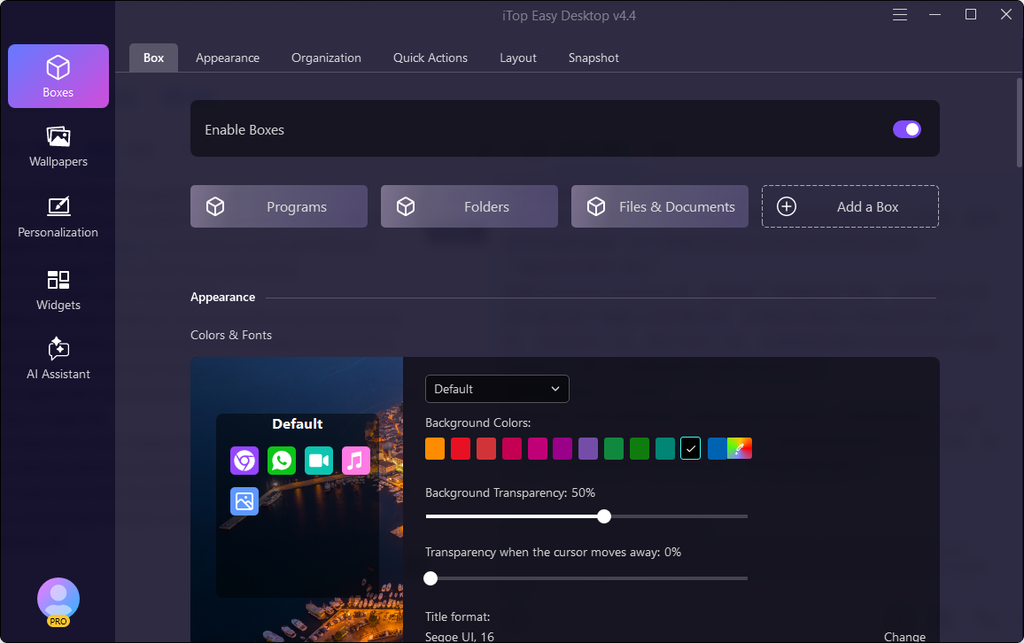
I created separate boxes for active client work, a folder of half-finished drafts, and one just labeled “deal with later” that I’m not proud of but appreciate having. Being able to name and color-code boxes around how I actually think, rather than a generic category system, made the setup feel personal instead of imposed.
The Folder Portal That Works Like a Mini File Explorer
One feature I didn’t expect to use as much as I do is the folder portal, which pins the contents of any folder directly onto the desktop as a live, browsable panel. Instead of clicking through File Explorer to reach a folder buried three levels deep, I can see its contents right there and open what I need in one step.
Discover New Files and Smart Roll
Discover New Files quietly notifies me when something new lands in a shared or downloads folder, which has saved me from missing files more than once. Smart Roll collapses boxes near the edge of the screen to save space without hiding their contents entirely, a small detail that ended up mattering more than I expected once I had several boxes running at once.
Wallpapers and Visual Customization
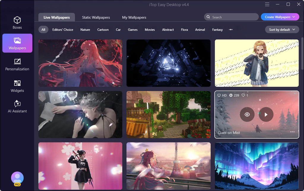
Beyond just keeping my files in order, iTop Easy Desktop offers something that genuinely surprised me—a massive collection of over 23,000 high-definition wallpapers, both live and static, all completely watermark-free. And I’m not talking about grainy, pixelated images here. These wallpapers are crisp, vibrant, and optimized to handle everything from standard displays all the way up to 4K and even 8K video playback without skipping a beat.
Beyond Organizing: Small Tools That Add Up
What surprised me most was that iTop Easy Desktop didn’t stop at sorting icons. A few extra tools built into the same interface ended up changing my daily routine in smaller, less obvious ways.
iNotes and Schedule for Staying on Top of Deadlines
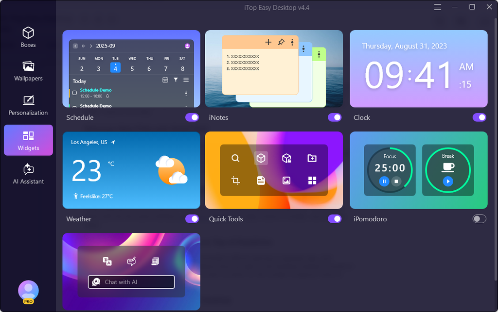
iNotes gives me a spot to jot down quick reminders without opening a separate app, and Schedule syncs with my calendar so deadlines show up right on the desktop instead of buried in a browser tab. Neither feature is flashy, but both cut down on the number of places I have to check to know what’s coming up.
A Pomodoro Timer Built Into the Desktop
The built-in focus timer breaks work into short intervals with breaks in between, and having it live on the same screen as my organized files meant I didn’t need a separate app just to manage my attention span.
Private Box for Sensitive Files
Private Box lets me tuck away files I don’t want visible during screen shares or when someone else is looking at my screen, which turned out to be more useful than I anticipated the first time a coworker leaned over during a call.
How It Compares to Stardock Fences
Before settling on iTop Easy Desktop, I looked seriously at Stardock Fences, since it’s the name most people mention first when they talk about desktop organization.
Why I Considered Fences First
Fences has a strong reputation and a polished interface, and it’s been around long enough to build real trust with a lot of users who deal with a high volume of desktop icons.
What Made Me Switch to iTop Easy Desktop Instead
The deciding factor came down to cost and how quickly I could get set up. Fences requires a paid license to unlock its full functionality, while iTop Easy Desktop gave me automatic organization, custom boxes, and the folder portal without asking for a subscription first. For someone who wanted to try the concept before committing money to it, that made the decision easy.
What Changed a Month Later
A month in, the biggest difference isn’t the appearance of my desktop, though that’s still satisfying every time I glance at it. It’s that I stopped dreading the small moments of friction that used to come with finding a file or remembering a deadline.
Organizing used to feel like a task I’d put off until the clutter became unbearable. Now it happens automatically in the background, thanks to the desktop organizer software quietly doing its job without getting in my way. And the extra tools mean I’m not bouncing between five different apps just to stay on top of a normal workday—everything I need is right there, grouped the way I actually work, not the way some rigid folder structure dictates.
That shift, from chore to habit, is the part I didn’t expect when I first installed it. I thought I was just getting a prettier screen. Turns out, I was getting a smoother, less stressful way to actually use my computer.


Creating one useful image is different from producing several that belong together. With ai image generation, a blog series, social campaign, presentation, or creative story can quickly accumulate pictures with mismatched colors, viewpoints, and levels of detail. A coherent set needs a shared direction and a clear purpose for each image. This guide explains how to plan that direction, generate individual candidates, and refine the collection without making every picture look identical.
- Why a Messy Desktop Quietly Wears You Down
- The Features That Made Organizing Feel Less Like a Chore
- Custom Boxes for the Way I Actually Work
- The Folder Portal That Works Like a Mini File Explorer
- Discover New Files and Smart Roll
- Wallpapers and Visual Customization
- Beyond Organizing: Small Tools That Add Up
- iNotes and Schedule for Staying on Top of Deadlines
- A Pomodoro Timer Built Into the Desktop
- Private Box for Sensitive Files
- How It Compares to Stardock Fences
- What Changed a Month Later
Define what the project needs before generating images
List the actual deliverables and where they will appear. A blog project might need a feature image and several explanatory illustrations. A social series might need an introduction, examples, and a summary card. A campaign might need a wide banner, portrait announcement, and supporting visuals.
Write the job of each image beside its destination. One may establish the subject; another may clarify a comparison; another may support a practical next step. This prevents a collection of attractive pictures from becoming a project with no clear visual structure.
Decide whether the images will be seen in order or independently. A carousel needs progression between frames. Several article images need to support the relevant sections without necessarily forming a continuous scene. A campaign can share an identity across placements even when viewers encounter only one asset.
Generate according to those needs rather than setting an arbitrary image count. If two images contribute the same information, consider whether the project actually needs both.
Choose a small set of shared visual rules
Identify the choices that should connect the collection: palette, illustration treatment, lighting, viewpoint, background complexity, and the way subjects occupy the frame. Keep the rules concrete enough to use while writing prompts and reviewing candidates.
For example, a research-themed editorial project could use a restrained blue-and-cream palette, simple paper objects, soft overhead light, and an uncluttered desk viewed from above. Those choices establish a recognizable family while allowing different arrangements to explain different ideas.
Separate shared rules from image-specific decisions. The palette might remain stable while object position changes to accommodate a headline. The illustration treatment might stay consistent while the subject changes from cards to folders. Uniformity should not prevent an image from doing its own job.
Avoid relying on a vague phrase such as “same premium style” as the whole specification. Describe the visible qualities you want another person to recognize across the set.
Create a reference image before expanding the collection
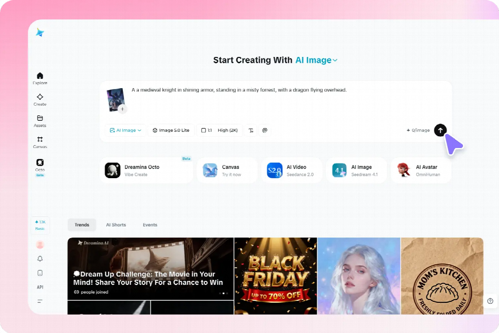
Develop one representative candidate and inspect it inside the actual project layout. Choose a scene that contains enough of the intended treatment to guide later images without being unnecessarily complicated.
In Dreamina, use a written description or supported reference to explore that first image. A proposed brief is: “Original editorial illustration of three groups of plain reference cards beside one closed notebook, overhead view, muted blue and warm cream colors, soft consistent shadows, simple shapes, clear background, no lettering, logos, decorative charts, or extra stationery.”
Review more than its attractiveness. Does the viewpoint support the project? Are the objects readable at the intended size? Does the detail level leave room for the accompanying content? Correct obvious structural problems before treating the image as a reference.
Keep the approved source and a short description of what it establishes. A reference can communicate style, object appearance, or composition, but it does not guarantee that every later result will preserve those features exactly. The prompts here are suggested examples, not reports of tested outputs.
Give each image a separate, focused prompt
Use the shared direction as a stable starting point, then describe the specific subject, relationship, and composition needed for each image. Do not paste the entire project plan into every request.
For a comparison graphic, the brief might specify two clearly separated arrangements of the same paper objects. For a section about selecting information, it might show one card separated from a larger group. For a summary, it might show several groups connected to a central notebook.
Keep each image’s visible state explicit. “Three organized groups” differs from “scattered cards awaiting sorting.” If the prompt describes both conditions without explaining the intended arrangement, the result may blend them into an unclear composition.
Where supported, supply the approved reference and explain its role. Retain the palette and illustration treatment while changing the subject arrangement. Review the output for the requested difference as well as the shared features.
Apply the method to blog and explanatory images
For an article or presentation, begin with the difficult points the visuals need to clarify. A feature image can introduce the broad subject, while supporting pictures explain particular relationships. They can belong to one family without repeating the same composition.
For a planning article, one image might establish the scattered information, another show categories, and a third illustrate a selection decision. Keep comparable objects and viewpoint when they help readers inspect the change. Add exact labels separately when that provides better control.
Do not force an explanatory picture to imitate a feature image’s decorative density. A simpler arrangement may be more useful when the audience needs to compare details. Preserve the shared treatment while allowing the amount of information to match the task.
Use verified source material for precise data, interfaces, real product features, or documented processes. Generated conceptual illustrations can support an explanation without pretending to establish factual evidence.
Adapt the set for social and promotional content
A social series needs a recognizable direction and a distinct contribution from each card. Use a shared palette or motif while changing the image to support the actual message. Avoid producing several near-identical scenes with only a different caption.
For a campaign, distinguish introductory, explanatory, and reminder assets. The introduction may establish the situation; the explanatory visual may need approved product material; the reminder may need a calmer background for practical copy. Their layouts can differ while their treatment remains related.
Preview each image with its real headline or caption. A wide banner’s useful empty region may disappear in a portrait crop. Change the subject position or create a companion composition rather than assuming one source can simply be resized for every placement.
For authentic products, retain accurate source assets and use generated material for appropriate supporting roles. A consistent-looking collection is not successful if it repeatedly alters the item being promoted.
Keep recurring characters and objects recognizable
For creative illustrations, record the features that matter for recognition: a character’s clothing, an object’s silhouette, or a setting’s main landmarks. Use a few clear references rather than expecting perfect repetition of every incidental surface.
A fictional traveler might retain a blue coat and small cream bag across several scenes. The action and setting can change, but the bag should not disappear without a reason. If it changes hands, decide whether the story establishes that change or whether the image needs correction.
A story also needs the right information at the right moment. Do not reveal an outcome in an earlier illustration simply because the full plot was included in the prompt. Brief the current scene rather than asking the generator to summarize the entire narrative.
These continuity checks are one application of the broader method. An explanatory set needs dependable object relationships; a promotional set needs accurate items and a coherent identity. Choose the important constants according to the project.
Review the collection together, not only image by image
Place the candidates side by side in a simple overview, then inspect them in their actual sequence or placements. A picture that looks effective alone may use much stronger contrast or a different viewpoint from the rest.
Compare subject scale, background complexity, lighting, and visual weight. Identify which difference is distracting and which is justified by the task. A summary graphic may need fewer objects; a comparison may need a more structured arrangement.
Then check meaning. Does each picture support its assigned message? Does an accidental change in object size or state suggest information the content never intended? Consistency includes reliable communication, not only matching colors.
Ask a reviewer what connects the set and what they understand from each image. If everything looks related but the individual messages are indistinguishable, increase purposeful variation rather than adding more decorative consistency.
Correct mismatches at the right level
For a small defect in an otherwise suitable candidate, a selected-area correction may preserve the useful composition. Review nearby boundaries and shadows after the change. If the whole treatment differs, a new candidate using the approved direction may be more appropriate.
If a reference-led result repeats the wrong composition, clarify what should change. If the colors drift, restate the limited palette. If the viewpoint varies unintentionally, describe the shared view in concrete terms rather than adding more style adjectives.
Keep exact wording, labels, and required information editable in the finishing layout when that offers better control. Do not regenerate an entire picture solely to correct a date or line break that can be handled reliably as text.
When replacing one image, review the surrounding set again. A correction can improve the individual asset while creating a new mismatch in scale or emphasis. Approve the replacement for its actual role in the collection.
Keep a usable master set for future changes
Store the approved references, shared visual rules, individual prompts, editable layouts, and final exports together. Identify which version belongs to each destination so a rejected candidate is not reused because it has an attractive thumbnail.
For an ongoing series, add a short note explaining the job of each image and what should remain stable. A new contributor can then create another relevant asset without copying the previous picture or inventing an unrelated direction.
Check final crops and text at the actual viewing size before distribution. Fine details can disappear, and a new caption can change the interpretation of an otherwise familiar image. Reuse the visual reasoning, not just the file.
A strong set combines recognizable shared choices with meaningful differences. Planning both allows AI generation to support a coherent project, with each image contributing something specific instead of merely increasing the number of assets.

A client of mine once ran a dashboard that was green across the board. Every developer, every supplier, every stakeholder had hit their own deadline that week. He was genuinely confused two weeks later when the launch date slipped for the third time.
- How Can a Project Be Late When Everyone Finishes Their Tasks?
- The Hidden Time Between Tasks Is Where Deadlines Start to Drift
- 7 Reasons UK IT Projects Slip Even When Tasks Stay on Schedule
- Why Being 90% Complete Can Still Leave You Weeks From Launch?
- Warning Signs Your IT Project Is Drifting
- Why Busy Teams Can Still Make Very Little Progress?
- How to Stop Deadline Drift Before It Becomes a Missed Deadline?
- When Does a UK Business Need External Project Management?
- What Outsourced Project Management Can Change?
- Task Problem or Management Problem?
- Frequently Asked Questions
- Conclusion
IT projects rarely fall apart because someone dropped the ball. They fall apart in the space between the balls, in the approvals, the hand-offs, the decisions that sat in someone’s inbox for four days. This is exactly the space outsourced IT project management exists to fill, not by fixing lazy teams, but by owning the connective tissue nobody else is watching. Finishing your tasks and finishing the project sound like the same thing. They aren’t.
How Can a Project Be Late When Everyone Finishes Their Tasks?
Take a fairly ordinary week. The developer finishes the API, the designer wraps up the interface, the supplier delivers hardware on schedule. Every box on the tracker turns green.
Yet launch is still weeks away. The API sits unintegrated. Nobody’s approved the interface. UAT, user acceptance testing, where real users try the system before it goes live, hasn’t started. A finished task is one piece; a finished outcome needs every piece connected, in order, at the right moment. What controls a launch date isn’t how many tasks got ticked off. It’s the critical path, the chain of dependent steps that actually determines when you go live.
The Hidden Time Between Tasks Is Where Deadlines Start to Drift
One team finishes early, then sits waiting on something another team hasn’t handed over yet. That waiting never shows up on anyone’s task list, because technically, nobody’s behind. Approvals do the same thing, sitting untouched for days without anyone noticing, and decisions are worse in some ways: a five-minute call can cost a week if nobody’s job is to chase it down.
7 Reasons UK IT Projects Slip Even When Tasks Stay on Schedule
Hidden dependencies were never mapped. Teams lean on systems, systems lean on suppliers. Miss one link, and the delay spreads downstream.
Hand-offs create time nobody can see. Work passes from IT to Finance to Security and back. Everyone does their bit properly, yet time vanishes in the gaps.
One person quietly becomes the bottleneck. A specialist gets pulled into three workstreams at once, hitting every deadline assigned to her personally while the wider project stalls anyway.
Small changes carry a bigger footprint than expected. A minor tweak to a requirement kicks off new development, integration, testing, and sign-off. The change was tiny; what it touched wasn’t.
Integration takes longer than building the parts. System A plus System B plus System C doesn’t just add up to a finished product. Integration is where incompatible systems and configuration issues surface, usually all at once.
Testing turns “finished” work back into active work. Test it, find a problem, fix it, retest, get it approved. “Development complete” doesn’t mean “ready to launch.”
Third parties can hold part of your timeline hostage. Cloud providers, telecoms companies, payment processors. Your own team can be entirely on schedule while the project waits on somebody outside your building.
Why Being 90% Complete Can Still Leave You Weeks From Launch?
Not every task carries equal weight, even though status reports treat them as if they do. Finishing twenty small tasks might move your finish date by almost nothing. Finishing one task on the critical path might shift it by three weeks on its own. The last 10% is usually where everything collides: integration, UAT, security checks, final sign-off. “We’re 90% done” tells you little unless someone can say what’s sitting in that last tenth.
Warning Signs Your IT Project Is Drifting
Milestone dates keep sliding without a clear reason. The same “waiting for” item reappears week after week. Decisions sit open for days with nobody’s name against them. Teams keep saying “almost there,” yet nothing launches. Suppliers can’t confirm dates, and scope changes get waved through informally. If a few of these sound familiar, the drift has already started.
Why Busy Teams Can Still Make Very Little Progress?
People confuse being busy with getting somewhere, and it’s an easy trap under pressure. A team can close forty tickets and send a hundred emails while the thing the business actually needs stays stuck. The more useful question isn’t how many tasks got closed this week. It’s simpler: can the system go live?
How to Stop Deadline Drift Before It Becomes a Missed Deadline?
Map dependencies before work starts, not after something’s stalled. Work out the critical path early, so everyone knows which activities genuinely control the finish date. Give every blocker a name attached to it, “the team needs to sort this” solves nothing, “Sarah owns this, resolved by Thursday” actually moves. Put deadlines on decisions too, not just deliverables.
When Does a UK Business Need External Project Management?
A few signs tend to show up together: an internal team stretched too thin for coordination, nobody clearly owning the space between departments, constant chasing for updates that should be automatic, suppliers with timelines that don’t line up, and senior staff spending more hours coordinating than running the business.
This is usually the point where outsourced IT project management becomes worth considering, not because outsourcing is automatically the better path, but because someone needs to own the connections between teams that nobody currently does.
What Outsourced Project Management Can Change?
| Project pain | What external oversight provides |
| Hidden dependencies | Dependency tracking from day one |
| Constant chasing | Proactive follow-up, not reactive panic |
| Unclear ownership | A named person against every blocker |
| Moving milestones | Ongoing schedule monitoring |
| Supplier delays | Direct third-party coordination |
| Slow decisions | Decisions tracked like any other deliverable |
What would actually be different if one person owned the whole project instead of everyone owning their own slice of it? That question tells you more than any generic list of outsourced project management services ever could.
Task Problem or Management Problem?
A task problem is straightforward: someone genuinely can’t get their assigned work finished. A management problem looks different. The work itself is done, but nobody’s sure what happens next, another team is stuck waiting, or a decision that should’ve taken an hour has sat untouched for a week.
Frequently Asked Questions
Why can an IT project be late if everyone completes their tasks on time?
Tasks lean on each other more than status reports let on. A finished task still needs integration, approval, or testing before it’s real progress. That step gets skipped in reporting far too often.
What’s the difference between task completion and project completion?
A task is one piece of work, finished on its own. Project completion needs every piece connected, in order, at the right moment. Finishing one doesn’t guarantee the other.
How do dependencies cause IT project delays?
One team’s finished work often becomes another team’s starting point. A late hand-off pushes everything scheduled after it further down the line. Across several teams, those small delays stack up fast.
What are the early warning signs of IT project delays?
Milestone dates that keep sliding are usually the first sign. Repeated “waiting for” items and stalled decisions tend to follow close behind. Spot two or three together and drift’s already started.
When should a business consider external IT project management?
Once nobody clearly owns the gaps between different teams, honestly. It’s also worth it when senior staff spend more time coordinating than actually delivering. At that point, someone needs to own the whole picture, not just their corner of it.
Conclusion
A project doesn’t succeed simply because everyone finishes their own piece of it. It succeeds when those pieces connect at the right time, in the right order, with approvals and decisions already sorted. Track the dependencies. Watch the critical path. Put a name against every blocker.
Eco Outsourcing is who closes that space for UK businesses, taking ownership of the connections between teams so deadlines stop drifting in the first place.
Older Windows PCs rarely fail all at once. They slow down gradually. Background apps eat RAM, startup programs crowd the boot process, and leftover files fill the drive. Before long, CPU usage spikes and the desktop takes minutes to load.
Sound familiar? Most slowdowns trace back to clutter you can safely remove.
We tested popular optimization utilities on a sluggish Windows laptop to see which ones actually help. This test-based comparison shows what each tool does well, where it falls short, and how to measure results yourself. If you want a reliable PC cleaner, start here.
Criteria for Testing PC Optimization Utilities
We tested each tool on the same aging Windows laptop and judged it on four factors that matter on a slow machine:
- Ease of use: Can a beginner run it without reading a manual?
- System resource recovery: Does it free up RAM and disk space you can actually see?
- Depth of clean: Does it go beyond temp files into startup items, registry clutter, and browser leftovers?
- Safety: Does it back up changes and avoid touching critical system files?
A good PC cleaner should score well in all four areas, not just one.
Top Recommended Optimization Tools
1. Advanced SystemCare
Features: In our testing, Advanced SystemCare proved to be the most comprehensive tool available. With just a single click, it cleans up registry entries, disk clutter, and junk files left behind by apps and extensions. Beyond basic cleaning, it lets you intuitively manage startup programs to speed up boot times. It also monitors RAM and CPU usage in real time, optimizing resources in the background to free up memory and boost overall system performance.
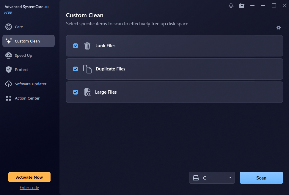
The latest Advanced SystemCare 20 update brings a sleek, modern UI redesign. We were particularly impressed by the new Custom Clean feature, which quickly identifies duplicate and large files—making it effortless to reclaim valuable disk space.
Performance Test Result: In our tests, startup time dropped noticeably, and one scan cleared gigabytes of hidden junk, including leftover update files and browser caches. We also noticed fewer background processes running at idle. The PC felt more responsive right away.
Best For: Comprehensive daily maintenance as an automated Windows cleaner. Advanced SystemCare suits people who want regular upkeep without manual work.
2. CCleaner
Features: CCleaner is a practical, safe maintenance tool focused on junk cleanup and browser privacy. It offers one-click automated care via Health Check alongside full manual control for deeper cleaning.
Designed for deeper control, CCleaner features a Performance Optimizer, startup manager, registry cleaner, real-time monitoring, and flexible scheduled cleaning for predictable maintenance.
Performance Test Result: CCleaner is built to be lightweight, straightforward, and ready to run right out of the box. In our tests, junk file cleanup took just a single click. The only downside is that the free version features frequent ads, which require manual closing.
Best For: Users who prefer lightweight software.
3. Native Windows Built-in Tools (Storage Sense & Disk Cleanup)
Features: Storage Sense and Disk Cleanup come with Windows, so there is nothing to install. Both are safe to run and need no learning curve. They clear temporary files, Recycle Bin contents, and old update leftovers. Storage Sense can even run on a schedule.
Limitations: They do not manage startup programs, perform deep registry cleanup, or tune RAM in real time. That makes them a fair starting point, not a full tune-up.
Performance Test Result: In our tests, they recovered a fair amount of disk space, but boot time barely changed. Still, the cleanup was safe and quick, which counts for a lot.
Best For: Light upkeep on a healthy PC. They are safe, free, and worth enabling no matter what else you use. Pair them with a dedicated tool if boot time is your main problem.
A Step-by-Step Guide to Speeding Up Your PC
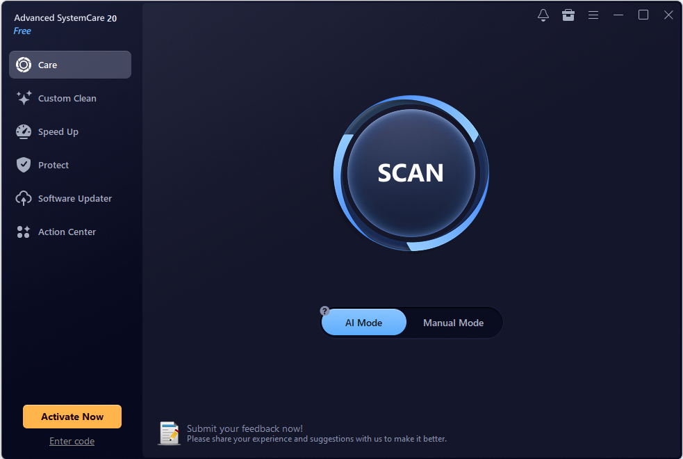
Here is a clear, concise guide showing how to use Advanced SystemCare to clean, optimize, and speed up your PC.
Step 1. Launch the PC Optimizer
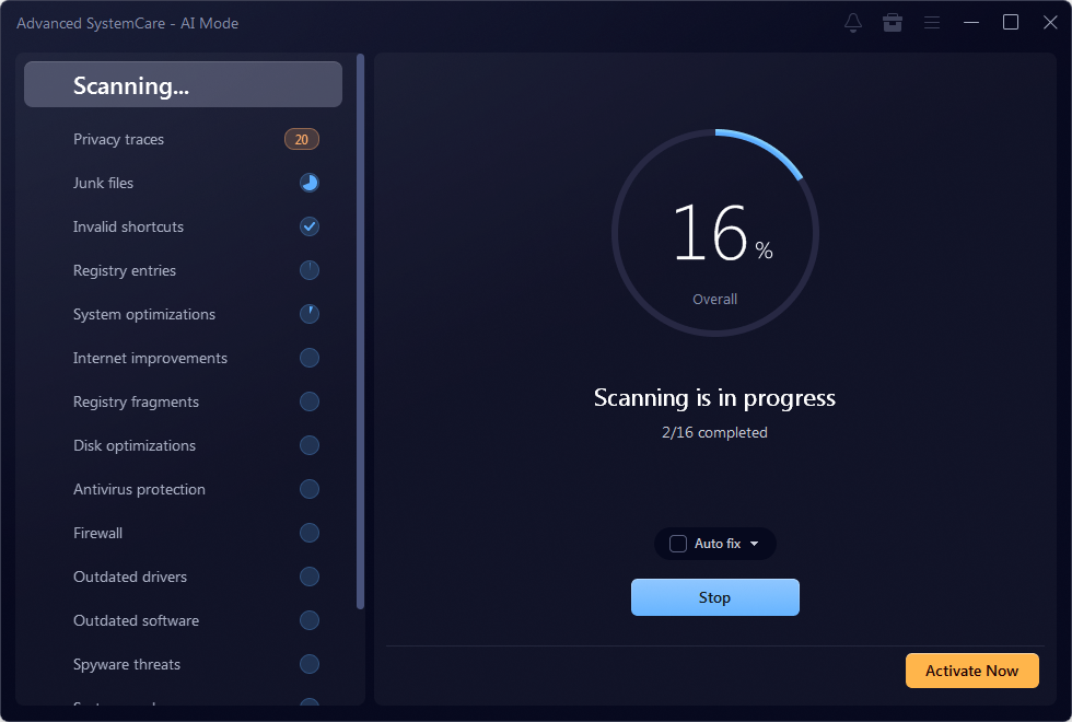
After downloading and installing this PC cleaner, launch it on your Windows PC. Please be careful not to select any bundled software. Under the “Care” tab, click “SCAN” in AI Mode to automatically scan all the files & items on your PC.
Step 2. Clean up & Auto Fix
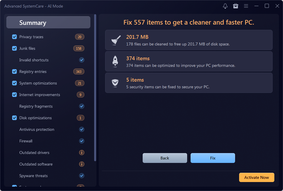
As shown, Advanced SystemCare detected 201.7 MB of unnecessary files and 379 items. Next, click on “Fix” to clean up junk files and auto-fix system errors to optimize PC performance easily.
Step 3: Manage Startup Programs
Navigate to the Speed Up tab and select Startup Optimizer. Disable non-essential applications and background services from launching at boot. This dramatically reduces boot time and frees up memory immediately.
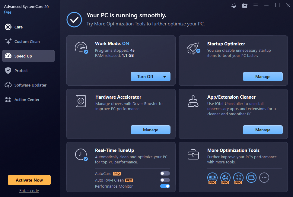
Step 4: Free Up Disk Space with Custom Clean
Switch to the Tools or Custom Clean section. Run a scan for Large Files and Duplicate Files. Review the list and delete unneeded duplicates or massive leftover files to reclaim valuable SSD/HDD space.
Conclusion
Our tests showed that a dedicated PC cleaner can speed up an aging system more than Windows’ built-in tools alone, mainly through startup management and deeper cleanup. The biggest wins came from trimming startup items and clearing hidden junk. Advanced SystemCare delivered the most noticeable results, while Storage Sense remains a solid baseline. Pair a trusted Windows cleaner with regular restarts and updates, then re-test your PC to see the difference yourself. Monthly maintenance keeps slowdowns from creeping back.

Perfume Packaging Guide: Choosing the Right Box for Bottle Size, Protection, and Brand Image

Veneers in Real Life: What You Should Know Before You Change Your Smile

What Most People Get Wrong About Preventive Dental Care

Alex Pettyfer Net Worth, Wife, Age, Height, Children, Career and More

Brad Williams Net Worth, Wife, Height, Age, Daughter, Family, Career and More

Eldorado.gg Review 2026: How It Works, Safety, Fees, and Risks
-
Celebrity10 months ago
Alex Pettyfer Net Worth, Wife, Age, Height, Children, Career and More
-
Celebrity11 months ago
Brad Williams Net Worth, Wife, Height, Age, Daughter, Family, Career and More
-
Blog2 months ago
Eldorado.gg Review 2026: How It Works, Safety, Fees, and Risks
-
 Anime11 months ago
Sanzoku Bandits of One Piece: Origins, Higuma, and Their Role in Dawn Island
-
 Celebrity11 months ago
John McGinn Net Worth, Age, Height, Wife, Childrens, Career and More
-
 Celebrity11 months ago
Frances de la Tour Net Worth, Age, Height, Husband, Childrens, Career and More
-
 Celebrity11 months ago
Will Trickett Net Worth, Wife, Childrens, Age, Career and More
-
 Blog2 months ago
Crackstube: A Complete Guide to the Digital Publishing Platform